Logomme tarina
(In English below)
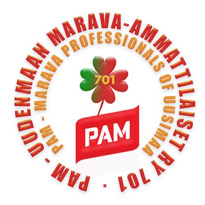
Neljä hyvää ystävää yhdistyi yhdeksi isoksi ammattiosastoksi. Logossa on neljä sydäntä, jotka muodostavat neliapilan. Sen taas uskotaan tuovan onnea. Apilan juuret ovat Pamissa. Väreillä on merkityksensä. Punainen on Pamin väri, mutta meillä on myös vihreitä arvoja. Keltainen on toivon väri.
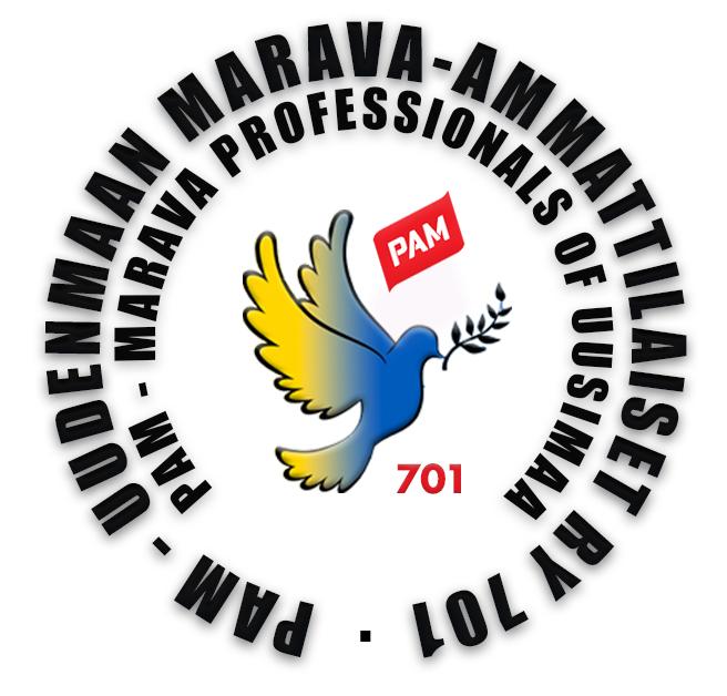
Venäjän hyökkäysodan alkaessa, halusimme ilmaista tukemme Ukrainalle ja otimme käyttöön väliaikaisen Ukraina -logon.
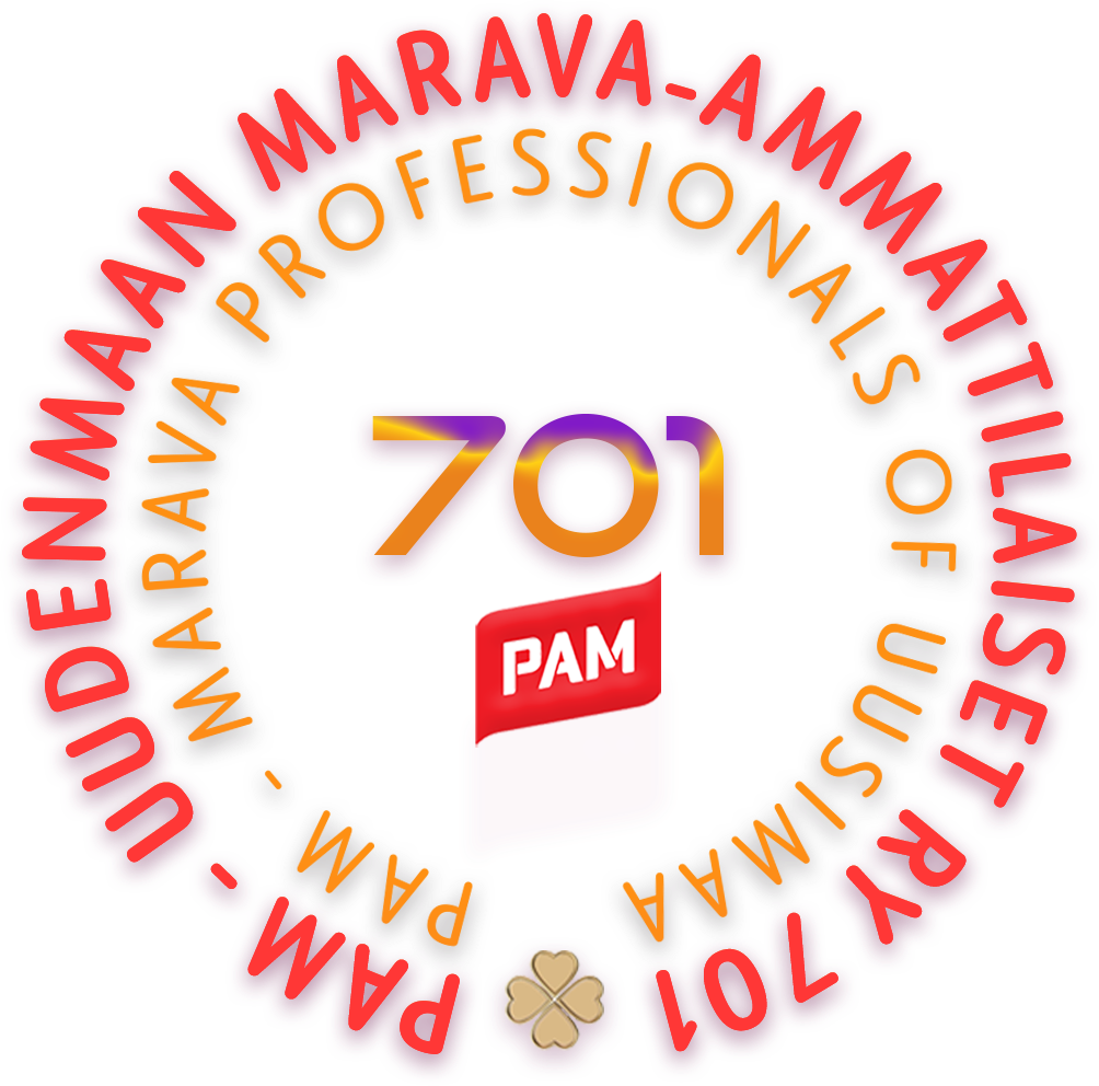
Logommme sai uuden ja uljaan ilmeen loppuvuodesta 2023. Onnen neliapila on vielä jäljellä, mutta entiset osastot ovat nyt täysin sulautuneet uudeksi hienoksi osastoksi 701. Mara-alan lila väri on myös läsnä.
The story of our logo
Four good friends joined together to form one large trade union branch.
Our logo features four hearts forming a four-leaf clover – a symbol believed to bring good luck. The clover's roots lie in PAM. Each color in the logo has meaning: red represents PAM, but we also hold green values. Yellow stands for hope.
When Russia launched its war of aggression, we wanted to show our support for Ukraine and introduced a temporary Ukraine-themed logo.
At the end of 2023, our logo received a fresh and proud new look. The lucky four-leaf clover remains, but the former branches have now fully merged into the new and unified Section 701. The purple color of the hospitality sector (Mara) is also present.